Everything you need to choose your brand's color palatte | Learn power of brand color psychology
- Varnika Bajaj
- Jul 22, 2022
- 5 min read

Fonts are the voice of a brand, whereas colours are the tone of the brand -PixsMagic

I would be lying if I said that the brand’s logos and their colors do not tell a story. Your logo and your brand color palette represents a lot more than you think.
Be it emails or websites or business cards or logos, your brand’s color palette is a big presence across all the marketing platforms.
There is no denying in the fact that everyone wants to make a first good impression and your color palette will have a huge role in that.
Your brand’s color palette must reflect on how you want your customers to perceive when they talk about your company.
Whether you are starting afresh or rebranding, it is time that you put a good thought in your color palette.
Why to Choose Brand Colours?

Brand palette helps your customers to connect with your brand, product & services. A definite brand color palette basically sets your company's value, trust, strength even more. Colors help your audience to easily recognize your brand.
And that is one of the primary reasons as to why brands are revamping or building their brand with a definite color palette.
How to Choose Your Colors

The colors you choose must really depend on what you are selling and keeping that in mind, you may pair several colors to evoke a certain feeling in your customers.
It is important that you must stick to two or three colors to create a sense of balance. These colors can be either complementary colors (colors that are on the opposite sides of the color wheel) or blue and orange.
For a split complementary palette, you should choose one color and the two colors on either side.
Or you may also want to go for a monotone look by selecting one color and then using it in a variety of tint, tones, and saturation.
All of this might sound overwhelming, but it really isn’t.
Breakdown for Each Color
It is time that we sit and learn about what each color represents.
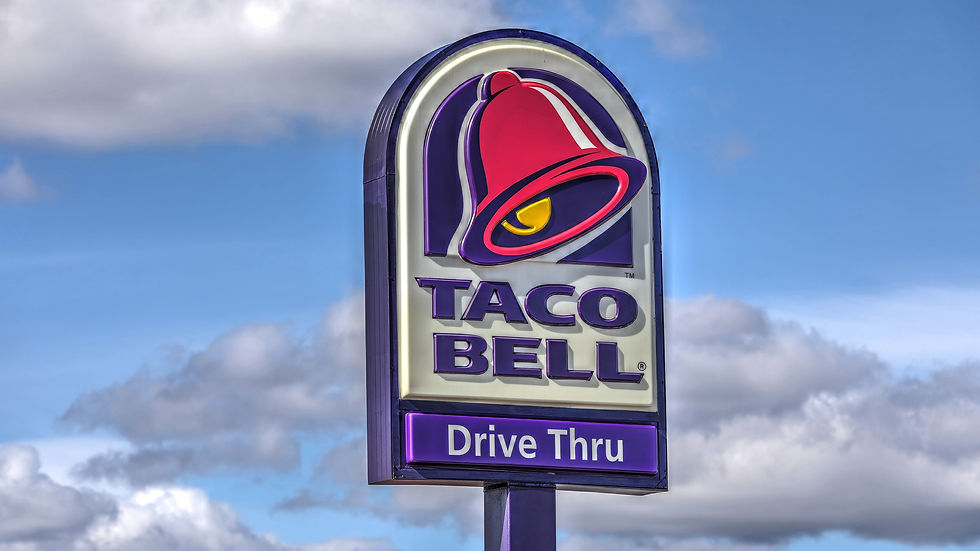
The Color Red

The color red is obviously a showstopper; in fact, red is used to make a big impact because it is a noticeable color and it literally ‘pops’ at you.
In general, the color red is usually associated with determination, passion, love, danger, desire, strength, and energy. The vibrant shades of red catch your attention and thus, it may force the customers to take a look at it.
Choose the red color when you want to grab your customers’ attention from afar. And on top of that, red color increases heart rate, so it might be a good choice to generate a response of excitement or passion in people.
Brands that use red in their color palette
Because of its eye-catching nature, red is a popular color palette within food and car industries. Brands like Zomato, Coca Cola use red to grab attention and stimulate the appetite. Whereas car companies like Kia, Toyota, Hyundai use red in their logos.
The Color Orange

Orange is known to be joyful and is associated with cheerfulness, playful, fun, and exuberant. Orange is more like a warm color that stimulates emotions and encourages people to take action. The color orange is perceived to b e alluring and lively.
Brands that use orange in their color palette
Orange palette is popular in youth, healthcare, food and technology companies. Well-known companies that use the orange palette are Swiggy, Nickelodeon, and Penguin Books. Companies that cater towards children have chosen orange to represent fun and cheerfulness.
The Color Yellow

Yellow represents optimism and happiness, and also it is associated with sunshine. This color evokes feelings such as energy, hope, and warmth. And there, you have another option for color palette branding when you are trying to create a positive and a lighthearted connection with their customers.
Brands that use yellow in their color palette
Color yellow is mostly used in food and technology industries. The color yellow is known to stimulate appetite as well. Brands like Lay’s, McDonald’s, Sonic, and Subway make a great use of the yellow color palette throughout their branding.
The Color Green

Green is known to be the most restful color to the human eye, it is a color of freshness, vitality, and health. The color green creates a connection for people with the real world and it is a color that is popular amongst different companies. Green is associated with serenity, health, wealth, and growth.
Brands that use green in their color palette
Green is popular among finance, food, and holistic industries. Companies like Animal Planet, John Deere, and Roots take people back to the nature and it gives the customers a feeling of grounding - both literally and figuratively.
The Color Blue

Blue is one of the most popular colors used by several brands as it is associated with trust, responsibility, and dependability. And these are the qualities that everyone wants their company to be.
Companies often choose a blue color palette to show that their company is successful, trustworthy, and confident. And the other reason for choosing a blue color palette is because it is a way to get people to buy.
Brands that use blue in their color palette
Blue is used in travel, technology, finance, agriculture, and healthcare industries. Most of the airlines have a blue color palette to signal trustworthiness. Indigo, United, and Southwest are a few of the airlines that have a blue color palette.
The Color Purple
Purple is a color that pulls its qualities from two colors - energy from red and stability from blue. On top of that, purple is one of those rare colors that produces a sense of nature and extravagance. This color is associated with royalty, luxury, and power.
Brands that use purple in their color palette
Though purple is not as popular as blue, you can find this color palette in finance and technology. If we talk about Airlines, Vistara and Hawaiian Airlines have a purple color palette.
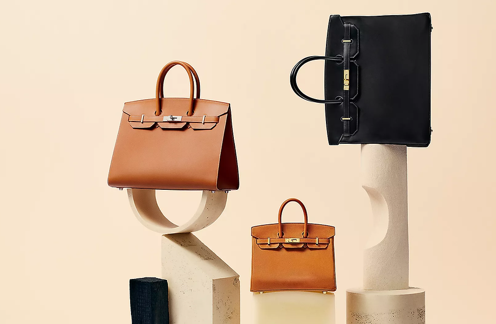
The Color Black

Black — everyone’s favorite color! Black is associated with the feeling of luxury and sophistication. Often perceived as power, prestige, and elegance, this color is the way to go. On the other hand, black can also be seen as grim or something scary.
However, when you pair colors like black and red, it will create a different feeling altogether and it will force people to look at your brand in a unique way. The pops of red against the black color will look sensual, powerful, and luxurious. If your brand prefers to deliver the finest things to their customers, black and red is the way to go.
Brands that use black in their color palette
Black is often tied to expensive brands, and this is one of the reasons why it is seen extensively throughout the clothing and car industries. Companies like Apple, Nike, Adidas, Gucci, Ferrari, and Chanel have used black color in their logos.
The Color White

White is often perceived as simplicity, cleanliness, innocence, or even purity. And that is one of the reasons why most of the cleaning products use white as a part of their color palette.
Brands that use white in their color palette
White is a perfect color to represent nature, healthcare, and children. The World Wide Fund and Disney Channel logo uses the color white in their logos.
How Does PixsMagic Choose a Color Palette For You?

Choosing a color palette can be really fun, but at the same time, it can be daunting when you realize that there is a lot more than just picking your favorite color. And that’s exactly when PixsMagic enters and sweeps you off your feet.
Our team at PixsMagic will not only give you a direction that you must take, but also we will provide branding services, digital marketing services, and all the graphics that you will need.
Still skeptical? Visit our website and find out for yourself!