Typeface 101: The Ultimate Beginner's Guide to Typography
- Himanshi Bisht
- Jul 18, 2025
- 5 min read


"Typography is the craft of endowing human language with a durable
visual form."
— Robert Bringhurst
Introduction
Fonts speak louder than words. While the message you convey is important, how it's visually presented can significantly influence how it's received. From websites and mobile apps to brochures, business cards, and social media graphics, typefaces shape user perception, mood, and action.
In a world overflowing with content, good typography helps you stand out. Whether you’re a beginner dipping your toes into design or a brand owner seeking consistency in visual identity, understanding the power of fonts is a game-changer.
This blog post will walk you through the essentials of typefaces — what they are, how to use them, and why they matter more than ever.
Table of Contents
Typeface 101: The Ultimate Beginner's Guide to Typography

Typography is everywhere. From the logo on your favourite coffee cup to the headlines on news websites, the design of the text we see influences our perceptions more than we realise. If you're a designer, a branding expert, a marketer, or even just a curious creator, understanding typefaces is a must.
In this comprehensive guide, we’ll dive into the fundamentals of typefaces, the difference between fonts and typefaces, types of typefaces, how to use them effectively, and why they matter more than ever in today’s digital world.
What Is a Typeface?
Let’s start with the most basic question: what is a typeface?
A typeface is a set of characters—letters, numbers, symbols—that share a common design. Think of it as a visual language. For instance, Times New Roman, Helvetica, and Roboto are all typefaces. They are the overall design or style of the characters.
A font, on the other hand, is a specific style and size of that typeface. So Helvetica Bold 12pt is a font, while Helvetica is the typeface. In casual usage, people often use “font” and “typeface” interchangeably, but understanding the distinction helps in professional design work.
Why Typography Matters

Typography affects everything from readability and tone to how trustworthy or modern your content feels. Here’s why it matters:
First impressions: Your choice of type can establish the tone of a brand instantly.
Clarity and legibility: The wrong font can make your message hard to read.
User experience: On digital platforms, typography guides navigation and understanding.
Emotion and personality: Fonts have personality. A playful typeface can make your brand seem friendly, while a clean sans-serif might project professionalism.
Also read: The Psychology of Color in Marketing
Main Typeface Classifications

Understanding the major categories of typefaces will help you choose the right one for every purpose.
1. Serif Typefaces
Serifs are the small strokes or lines attached to the end of a letterform. They’re considered more traditional and formal.
Best for: Print materials, books, formal documents, financial institutions
Examples: Times New Roman, Georgia, Garamond, Baskerville
Feel: Classic, reliable, intellectual, elegant
Why use them?
They guide the eye in printed text
Great for long-form reading
2. Sans Serif Typefaces
Sans-serif fonts do not have the decorative strokes (or “feet”) of serif fonts.
Best for: Websites, mobile apps, modern brands, minimalist designs
Examples: Helvetica, Arial, Open Sans, Roboto, Futura
Feel: Clean, modern, direct, efficient
Why use them?
Clean look on screens
Feel modern and neutral
3. Script Typefaces
Script fonts mimic cursive handwriting or calligraphy. They can be elegant or casual.
Best for: Invitations, logos, personal branding
Examples: Pacifico, Great Vibes, Brush Script, Allura
Feel: Romantic, personal, elegant, feminine
Use with caution:
Hard to read in large blocks
Works best in short headings or accents
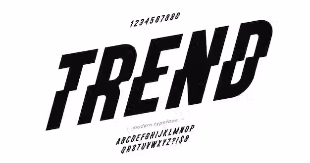
4. Display / Decorative Typefaces
Display fonts are designed to attract attention. They are unique, bold, and stylized.
Best for: Posters, logos, ads, magazine headlines
Examples: Lobster, Impact, Bebas Neue, Blackletter
Feel: Artistic, expressive, loud, unconventional
Use sparingly:
Not for body text
Great for identity and visual impact
5. Monospaced Typefaces
Monospaced fonts have equal spacing between characters, like on typewriters.
Best for: Coding, technical documents, retro-style designs
Examples: Courier, Consolas, Menlo
Feel: Technical, utilitarian, retro, minimal
Why use them?
Emphasize uniformity
Often used in programming environments
Anatomy of a Typeface
To understand how typefaces work, you need to learn a few key terms:
Baseline: The invisible line where letters sit
X-height: The height of the lowercase "x" — indicates readability
Ascenders: The parts of letters that rise above the x-height (e.g., in “h” or “l”)
Descenders: The parts that fall below the baseline (e.g., “g”, “p”)
Kerning: The space between two letters
Leading: The space between lines of text
These elements contribute to legibility, aesthetics, and usability.
Choosing the Right Typeface
When selecting a typeface, consider these factors:
1. Purpose of Your Content
Is it formal or casual?
Is it for print or digital?
2. Readability
Will people be reading this quickly or deeply?
How will it look on different devices?
3. Personality
Fonts communicate tone — is yours serious, fun, modern, or vintage?
4. Brand Consistency
Make sure the font aligns with your visual identity
Stick to 2-3 typefaces to avoid visual clutter
Combining Fonts: How to Create Perfect Font Pairings
Using multiple typefaces is common — but the key is in how you pair them.
DO:
Pair a Serif with a Sans Serif (e.g., Playfair Display + Open Sans)
Use contrast (thick vs. thin, bold vs. light)
Use font families with multiple weights/styles for consistency
DON’T:
Mix two fonts that are too similar
Use more than 2–3 fonts in a single design
Forget about hierarchy and readability
Common Font Mistakes to Avoid
Overusing script or decorative fonts — they lose impact
Too many typefaces on one page — creates confusion
Not optimizing for mobile — always test on multiple devices
Ignoring line height and spacing — affects legibility
Modern Typeface Trends
Typography evolves just like any aspect of design. Here are a few modern trends:
Variable fonts: One file, many styles — more flexible and faster loading
Custom typography: Brands designing their own fonts for a unique identity
Geometric sans-serifs: Clean, symmetrical fonts are trending in tech
Retro styles: Vintage serif fonts with modern twists are coming back
Where to Find Great Fonts
Here are some trusted sources for high-quality fonts:
Google Fonts (free, web-safe)
Adobe Fonts (formerly Typekit)
Fontsquirrel (free commercial-use fonts)
DaFont (use with caution; not all are licensed for commercial use)
MyFonts (premium and unique fonts)
Final Thoughts: Typography as a Design Power Tool
Choosing the right typeface is more than just an aesthetic decision — it's a strategic one. It can make your brand feel modern or vintage, bold or refined, playful or serious. When used well, typefaces enhance readability, guide user attention, and define your message visually.
Whether you're designing a website, creating social media content, or putting together a resume, your choice of type can make or break the viewer's perception.
Typography is not just about what you say, but how you say it.
So the next time you sit down to design something, don't just settle for the default font. Think about your brand voice, your audience, and your message. With a bit of understanding and intentionality, you can use typography to elevate your entire design.
Need help choosing the right typeface for your project or brand?
Reach out to our team of design experts — we love helping businesses find their perfect visual voice!


